1. INTRODUCTION
In recent years we have seen the explosive growth of small Internet devices
such as handheld computers, personal digital assistants (PDAs) and smart phones
that have been used to leverage the capabilities of the Web and provided users
with ubiquitous access to information than ever before. Despite the
proliferation of these devices, their usage for accessing the Web today is still
largely constraint by their small form factors such as small screen. Because
most of today¡¯s web page has been designed with the desktop computer in mind,
and is often too large to fit into the small screen of a mobile device. Web
browsing on such small devices is like seeing a mountain in a distance from a
telescope. It requires the user to manually scroll the window to find the
content of interest and position the window properly for reading information.
This tedious and time-consuming process has largely limited the usefulness of
these devices.
In order to improve the browsing experience, adaptation methods have been
proposed to modify web contents to meet the requirement of client capability and
network bandwidth [2¨C7,9¨C11,15]. In [6], methods were proposed for distilling
web objects to reduce the consumption of network bandwidth and client
computation. For web pages, the existing methods are mostly based on discarding
format information. While this method mainly focuses on reducing resource
consumption, there are still many works on beautifying the web page
representation on small form factor devices. In [9], the web page is reformatted
on the basis of page annotation. However, this approach requires a practical
solution to facilitate the creation of annotations for existing web pages. The
re-authoring technique proposed in [2] required web pages to have sections and
section headers, which however, are rarely used in web page authoring today.
In the work of Buyukkokten et al. [3,4], an accordion representation
is generated and the detail content can be folded or unfolded at client device.
Since this method focuses on text summarization, it does not leverage the
graphic capabilities of current devices. The SmartView [10] bears some
similarity with our work in presenting adapted web page using zoom-in and
zoom-out features.
1.1 A New Browsing Method
Our goal is to find a better way to enable easy navigation and browsing of a
large web page on a small-form-factor device.
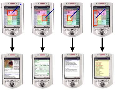
Figure 1. The idea of organizing a web page into a two
level hierarchy with a thumbnail representation for providing a global view with
each block of semantically related content represented by a different color. By
clicking on a block in the thumbnail, a user can easily go to view the
corresponding content which is formatted to fit well into a small
screen.
Our major idea is to provide an overview of the web page and allow the user
to select a desired portion of the web page to zoom in for detail reading (as
shown in Figure 1). The overview is like a Table of Content (TOC) for the
original web page. Instead of using traditional text based TOC, we provide a
thumbnail on which each block of semantically related content is represented
with a different color. By clicking on a block in the thumbnail, a user can
easily go to view the corresponding content which is formatted to fit well into
a small screen. Figure 1 shows the process of this browsing convention.
In this paper, our major contributions are:
- A novel idea of enabling easy browsing of a large web page on a small
screen device is proposed.
- A comprehensive page layout analysis algorithm is proposed to detect the
structure of an existing web page.
- The proposed method has been implemented and tested on a large set of web
sites and pages to prove its applicability.
The rest of this paper is organized as follows. Section 2 describes the
overview of our approach. Section 3 presents the detail of page analysis
algorithm. Section 4 introduces the web page adaptation method.
Section 5 provides the performance evaluation of our approach and describes
the auto-positioning method. We conclude our work in Section 6.
2. OUR APPROACH
In order to enable the new browsing method described in Section 1.1,
there are two technical problems we need to solve. One is how to detect the
semantic structure of an existing web page, and the other is how to split a web
page into smaller blocks based on the detected structure. Therefore, our
approach for web page adaptation consists of two processes as shown in
Figure 2.
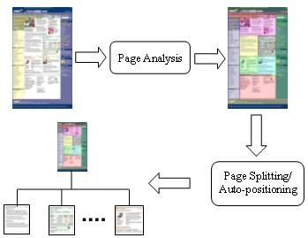
Figure 2. Our approach for web page adaptation consists of
two processes. The first process analyzes the structure of a give web page, and
the second process splits the web page into a two-level hierarchy. For a web
page not suitable for splitting, an auto-positioning method (or
scrolling-by-block) is used to provide a similar user experience.
The first process performs a page analysis to extract the semantic structure
of a web page. From the extracted structure, different content blocks are
identified. In the second process, the web page is split into many sub-pages
according to the structure information. For a given web page, a thumbnail is
generated at the top level and served as the navigational entry for all the
sub-pages at the bottom level. In case that a web page is not suitable for
splitting, an auto-positioning method or scrolling-by-block is used to provide a
similar user experience without physically breaking up the original web
page.
3. PAGE ANALYSIS
The goal of page analysis is to extract the semantic structure of an existing
web page. This structure is a hierarchical representation of the web page, in
which each node is a group of objects in the web page. A node at a higher level
of the hierarchy tends to contain multiple objects with different information
while a node at a lower level tends to contain a single or a small number of
objects that is a part of an information unit. The goal of our page analysis is
to identify a set of nodes in the hierarchy, in which each represents a unit of
information that can be managed and displayed individually as described in
Section 1.1. These nodes are called ¡°content block¡± in the rest of this
paper.
In our approach, identifying the content blocks from the semantic structure
of a web page is conducted in an iterative manner. At the beginning, the whole
web page is regarded as a single content block. At each iteration, the page
analysis algorithm finds a best way to partition a content block into smaller
ones. A set of content blocks will remain at the end of the process, which
serves as the final information for page splitting. Figure 3 shows this
process.
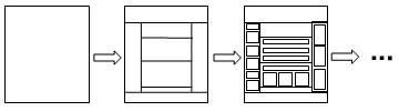
Figure 3. The process of identifying the content blocks is
performed in an iterative way. It starts with the whole web page as a single
content block, and then iteratively partitions each content block into smaller
ones until the process reaches the final solution.
The final solution is dependent on the information contained in a web page
and can be derived by semantic analysis. However, today¡¯s natural language
technology is still far from delivering a satisfactory result. Our approach is
to perform the analysis by inferring the content structure of a web page
embedded by the web author.
3.1 Content Structure Embedded by the Web Author
When the author creates a web page, he in general either uses a template or
has a page layout in mind to guide his design. For example, he may consider
whether to put a header, footer, or side bars in the page, and decide how many
distinct topics in the body. Although such a high-level content structure
usually disappears after the web page is constructed and sent to the client, it
is possible to recover this content structure based on the clues the author
embeds in the web page.
The author often creates a partition of content with visual separators. Two
kinds of visual separators are commonly used. Explicit separators are created
using certain HTML tags. Implicit separators are created by leaving a blank
space between content in a web page.
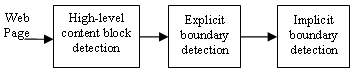
Figure 4. The three-step processing in our web page
analysis algorithm
Our page analysis algorithm consists of the following three steps: first, we
analyze the HTML DOM tree and detect the high-level content blocks about the
locations and sizes of header, footer, side bar and body; then we analyze the
content inside each high-level content block to identify explicit separators to
split the content blocks; lastly, implicit separators are detected and used to
split the content blocks further. The whole process is shown in
Figure 4.
3.2 High-Level Content Block Detection
When designing a web page, the author usually produces a scaffold or template
to guide the page design. The scaffold or template is the high level structure
of a web page. Layout related tags are often used to produce a scaffold or
template.
In most cases, a scaffold would contain one or more of the following blocks:
header, footer, left side bar, right side bar and body. Extracting the
high-level content block is to determine what content falls into which
high-level block. For any given content, we can decide which block it should
belong to by analyzing the position and shape of the region it occupies. For
instance, content in header and footer usually has a flat shape (i.e. small
height/width ratio), while header content locates on the top of a web page and
footer content locates on the bottom.
3.2.1 Selecting Nodes
We first use an HTML parser to generate the HTML DOM tree which also gives
the position and dimension information for each node in the DOM tree.
Then the DOM tree is traversed from <BODY> to its leaves to
select appropriate nodes and put them into a corresponding high level content
block. Selecting appropriate nodes is first conducted by deciding whether it is
better to keep a node as a unit or move one level down to consider its child
nodes as units. If a node is too large, keeping it as a whole will produce
erroneous results. For example, in the Yahoo! home page, the <BODY>
contains a single child node <CENTER> which is used to align all
the content to the center of the page. If the node <CENTER> is kept
as a whole, we will not be able to detect its header and footer.
Figure 5 shows the algorithm for selecting nodes. We try to classify a
node into one of the header, footer, left side bar and right side bar blocks. If
it belongs to none of the above, then we check if it is small enough to put into
the body block. A pair of thresholds (one for width and the other for height) is
used to determine whether a node is small enough. If the node exceeds the
thresholds, it will be split further. The above process is iterated until all
the nodes are classified into the five high-level blocks.
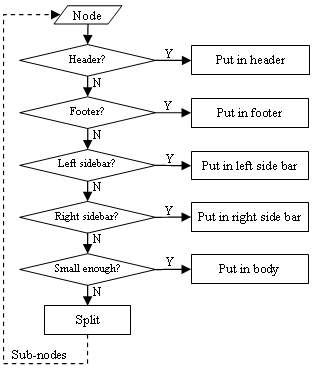
Figure 5. Selecting appropriate nodes and classifying them
into one of the five high level content blocks
3.2.2 Detection of Header and Footer
Since the header block locates on the top of a web page, it is intuitive to
define a threshold N and let the upper N pixels of a web page be
the header region. If the region rendered by a node is inside the header region,
the node is classified into the header block. Then the problem becomes how to
select an appropriate value for N. The challenge for selecting an
appropriate N is illustrated in Figure 6(a). In this figure, the
regions of two nodes overlap with the upper N pixels, and the node #1
does not belong to the header block while the node #2 does. In this case, we can
not exclude the node #1 while trying to include the node #2 by increasing the
threshold N since the bottom of the node #2 is lower than that of the node #1.
To solve this problem, a dynamic threshold based on the height/width ratio of
the shape of the region of a node is used. The smaller the ratio is, the bigger
the threshold is. Therefore, a node with flatter region will have a higher
possibility to be put into the header block.
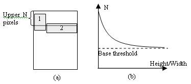
Figure 6. Dynamic threshold for header and footer
detection
Figure 6(b) shows the desired curve for the dynamic threshold which is
approximated by letting N = base_threshold + F(Height/Width) where
F(x) = a/(b*x+c) and base_threshold, a, b and
c are constants. In our experiments, we found that the best performance
can be achieved by setting base_threshold = 160, a = 40, b =
20, and c=1. A similar approach is also used for classifying nodes to
the footer block.
3.2.3 Detection of Left and Right Side Bar
The detection of left and right side bar is similar to the header and footer.
Since a side bar region depends on the width of the web page, the threshold
needs to be adaptive too. In our experiments, we define the left 1/4 part of a
web page to be the left side bar region, and right 1/4 part to be the right side
bar region. The shape of the region of a node is not taken into account because
the left and right side bars usually contain several small regions which are not
slim in many cases.
Figure 7 shows the result of high level content block detection for
Microsoft¡¯s home page. The blocks are represented by different colors.
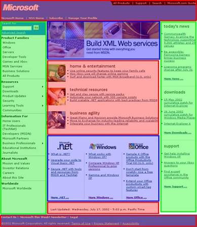
Figure 7. The result of high level content block detection
on the Microsoft¡¯s home page
3.3 Explicit Separator Detection
The algorithm described in Section 3.2 is used to detect the high-level
content blocks. We could apply explicit separator detection to further partition
them. For example, the third node in the body block as shown in Figure 8
contains three columns that can be further segmented for easy browsing.
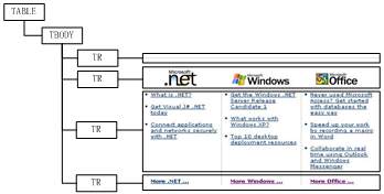
Figure 8. The DOM structure of the third node in the body
block in Figure 7
Explicit separators can be detected by analyzing the properties of the tags.
The following three types of explicit separators are widely used:
- <HR> is the most frequently used explicit separator for
representing a horizontal line in a web page.
- The tags such as <TABLE>, <TD> and
<DIV> have border properties. When their border properties are
set, there would be separators at the corresponding borders.
- The third type of explicit separator is created using an image. For
example, in Figure 9, the gray vertical lines that separate the content
into three columns are images embedded in very thin table cells. This type of
separator can be detected by analyzing the width and height of embedded
images.
By analyzing the above three types of explicit separators, the content in
Figure 8 is partitioned into 4 sub-blocks and the result is shown in
Figure 9. As can be seen, the upper one contains the icons. The three icons
are placed in one block because they are contained in a single image which can
not be segmented further. The lower part is divided into three columns.
In the next section, we will discuss the implicit separator detection to
divide each column further into two parts (as indicated by the dashed line in
Figure 9).
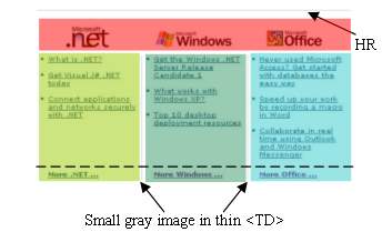
Figure 9. The explicit separator detection
3.4 Implicit Separator Detection
Implicit separators are blank areas created intentionally by the author to
separate content. Because they cannot be directly detected by analyzing the HTML
DOM nodes, special techniques have to be developed.
As these implicit separators are blank areas in a web page, we develop a
method to them by
- first collecting all the basic content blocks inside each high-level
content block after explicit separator detection;
- and projecting each basic content block along the horizontal and vertical
axes to generate projection diagrams;
- and based on the diagrams, the widest gap on each axis is selected as an
implicit separator to partition the block into smaller ones;
- The previous process is iteratively applied to the small blocks until no
implicit separator is detected.
Figure 10 shows an example containing a fragment from MSN home page
which contains four basic content blocks. By projecting them onto the vertical
axis, the diagram is generated. Zero projection value on the diagram indicates a
possible implicit separator. As can be seen, the biggest gap will partition the
fragment into two blocks and the other two smaller gaps will be detected to
divide each of the blocks further.
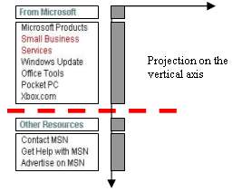
Figure 10. Detecting implicit separators
Because the implicit separator detection is based on the projection of basic
content blocks onto the vertical and horizontal axes, the size of basic content
block is critical to the precision of detection. Big content blocks may fail to
reveal fine boundaries while small blocks may produce more noise.
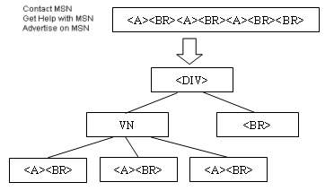
Figure 11. Detection of basic content block by pattern
recognition and clustering. VN represents a virtual node.
To resolve the problem, a method similar to that in [16] is used to produce
the basic content blocks. For example, the fourth content block in
Figure 10 is a <DIV> containing a sequence
"<A><BR><A><BR><A><BR><BR>". It
is obvious that the "<A><BR>" is the most frequent pattern
appearing in the sequence and can be grouped together. Then the three small
groups can be merged into a virtual node VN. Now the structure inside the
<DIV> becomes a form shown in Figure 11. The virtual node
VN is considered the basic content block since the last <BR>
represents an empty line.
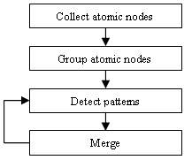
Figure 12. The pattern recognition algorithm is used to
produce basic blocks for implicit separator detection.
The pattern recognition algorithm is shown in Figure 12 and works as
follows. First, we define an atomic node to be a leaf node or a special tag such
as the tag <A> since it denotes a hyperlink and
<MARQUEE>, <SELECT> and <MAP>. If a leaf
node is a text node and is the only child of its parent tag, it will be selected
as the atomic node. All the atomic nodes in the HTML DOM tree are collected and
arranged in the same order as they appear in the HTML code.
A similarity measure based on text font, size, color, and tag properties is
applied to cluster the atomic nodes into groups. We denote the atomic nodes of
the same group with a same symbol, changing the node sequence into a symbol
string. From the string, we detect all the possible patterns (sub-string) and
compute their frequency in terms of times of appearance in the string. Among the
patterns with highest frequency, we select the longest one and group the pattern
using a new symbol if its length is larger than 1. If the length is equal to 1,
we try to merge it with the adjacent symbols. If no merge can be made, the
pattern with the next highest frequency will be selected. The same clustering
method is applied on the newly created string at each iteration until the
highest frequency is below a certain threshold.
We define a blank symbol to be <BR>, space characters, blank
<TD> (i.e. <TD> containing space characters only),
<MAP> or <SCRIPT>. Except these blank symbols, each
symbol in the last string represents a visual unit VN for implicit separator
detection.
4. PAGE ADAPTATION
The major problem for browsing a large web page on a small screen is
horizontal scrolling. A wide text body is often cut in half and requires
constant horizontal scrolling for reading. Our page adaptation tries to resolve
this problem by splitting a large web page into smaller sub-pages that fit well
into the small screen of a mobile device.
We consider two methods for splitting a web page: the first is called
single-subject splitting; and the second is called multi-subject splitting.
Single-subject splitting breaks the whole web page into several sub-pages and
connects them with next/back hyperlinks. When browsing an adapted web page, the
user will access each sub-page one by one in the defined sequence.
Figure 13(a) shows this scheme.
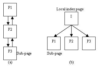
Figure 13. (a) Single-subject splitting. (b) Multi-subject
splitting.
Multi-subject splitting generates a new index page in addition to sub-pages.
The index page contains hyperlinks pointing to each sub-page. So the result of
multi-subject splitting is a two-level hierarchy of content as shown in Figure
13(b). While browsing an adapted web page, the user will first receive an index
page. This index page provides an overview and guidance for the user to access
each sub-page through the hyperlinks in the index page.
Single-subject splitting is suitable for a web page which contains the
content of a particular topic, such as a news story in the MSNBC web site.
Multi-subject splitting is more appropriate for the homepage of a web site. In
this paper, we use multi-subject splitting as an example to illustrate our page
adaptation technique.
4.1 Page Splitting and Sub-page Generation
Before conducting page splitting, we need to determine the appropriate size
of block so that it is smaller than or equal to the screen size. Based on the
result of page analysis, the content in the final set of content blocks can be
easily extracted and stored into sub-pages.
Some content cannot be put into a sub-page directly because of the problems
of style and hyperlink. In the following, we discuss how to resolve each of
these problems.
4.1.1 Dealing with Style
HTML standard permits the author to use Cascading Style Sheet (CSS) [12] and
style inheritance to specify content style. CSS allows the author to define the
style of a tag, a tag class or tag instance. Style inheritance allows the author
to specify a node¡¯s style at one of its parent nodes. Extracting content from a
block of HTML file may lose some style information because the style information
from CSS and inheritance is not located together with the content.
In order to keep the original appearance of a block, we need to retrieve its
style information. For the CSS case, since CSS is usually specified in
<HEADER> using <STYLE> or <LINK>, we
could copy the <HEADER> section of a web page into each generated
sub-page.
For the case of style inheritance, we must trace along the parent link of a
target node and retrieve all the style information of each parent tag. The style
information of each tag along the link is merged. Whenever there is a conflict,
a child tag will overwrite its parent tag.
4.1.2 Dealing with Internal Hyperlinks
Internal hyperlinks are often used to assist a user to locate content inside
a web page. For example, <A id=¡°id1¡±>¡</A> is used to specify
a place in a web page. Then <A href=¡°#id1¡±>¡</A> can be used
as a pointer to the specified place. When clicking on an internal hyperlink, the
browser will scroll directly to the specified location.
After a web page is split into several sub-pages, the place specifier and the
pointer may appear in different sub-pages. For example, <A
id=¡°id1¡±>¡</A> may appear in sub-page-1.htm while <A
href=¡°#id1¡±>¡</A> appears in sub-page-2.htm. Our solution is
to change the pointer in sub-page-2.htm to <A
href=¡°¡/sub-page-1.htm#id1¡±>¡</A>. The page splitting module is
responsible for searching the internal hyperlinks and making appropriate
modification.
4.1.3 Dealing with Relative Hyperlink Resolution
The author can specify an absolute hyperlink or a relative hyperlinks in
<A> and <AREA>. The Web browser resolves relative
hyperlinks to absolute ones according to the base URL of the web page. The
default base URL is the URL of the web page. But the author can override the
base URL using <BASE> tag. The <BASE> tag resides in
the <HEADER> section, which is another reason of copying the
<HEADER> section into each sub-page.
4.2 Index Page Generation
An index page which contains a thumbnail and hyperlinks to its sub-pages will
be generated after all the sub-pages are created. We first generate href
values based on the names of the sub-pages. For example, we could name each
sub-page in the form of origin_xxx.htm, where origin denotes the
name of the original web page and xxx denotes the number of a
sub-page.
We generate a thumbnail image for the original web page, and mark the content
blocks with different colors. Then we put an <IMG> tag to reference
the thumbnail image and corresponding <MAP> tag in the index page
(A <MAP> tag contains a hyperlink to a sub-page.). While browsing
an index page, the user can click on any block in the thumbnail to access the
corresponding sub-page. Figure 14 shows an example of the index page and
sub-pages generated from the homepage of MSN.com.
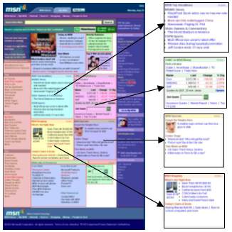
Figure 14. Page splitting for the homepage of
MSN.com
5. Experimental Results
We conducted some experiments to evaluate the performance of our algorithm.
To perform the experiments, we selected 50 popular web sites and 200 typical web
pages from them as our test data. Each web page is adapted using our algorithm
and the result is evaluated by testers to put into one of the following three
categories: perfect, good and error. Perfect means that the page analysis and
splitting is perfect without any error. Good means that the page analysis result
is correct but there are minor errors in page splitting and those errors do not
affect the viewing of the result. Error means that there are errors in both page
analysis and splitting processes, causing a browsing problem or losing some
information.
Table 1. The 50 tested web sites and the corresponding
results
| Web Site |
Perfect(%) |
Web Site |
Perfect(%) |
| Yahoo.com |
60% |
Msnbc.com |
17% |
| Msn.com |
50% |
Jobsonline.com |
0% |
| Aol.com |
60% |
Flowgo.com |
100% |
| Microsoft.com |
20% |
Earthlink.net |
25% |
| Altavista Search Services |
80% |
Americangreetings.com |
75% |
| Passport.com |
75% |
Ivillage.com |
100% |
| Hotmail.com |
60% |
Mypoints.net |
100% |
| Go.com |
80% |
Cnn.com |
20% |
| Netscape.com |
0% |
Goto.com |
0% |
| Amazon.com |
60% |
Bizrate.com |
75% |
| Excite.com |
40% |
Mapquest.com |
67% |
| Nbci.com |
100% |
Passthison.com |
0% |
| Ebay.com |
80% |
Weather.com |
75% |
| Bluemountain.com |
80% |
Mo.net |
50% |
| Lycos.com |
0% |
Collsavings.com |
100% |
| Real.com |
60% |
Infospace.com |
100% |
| Looksmart.com |
80% |
Iwin.com |
60% |
| Cnet.com |
80% |
Espn.com |
0% |
| Angelfire.com |
40% |
Colonize.com |
25% |
| Tripod.com |
80% |
Travelocity.com |
75% |
| Askjeeves.com Search & Services |
80% |
Windowsmedia.com |
0% |
| About.com |
100% |
Women.com |
0% |
| Speedyclick.com1 |
N/A |
Disney Online |
33% |
| Iwon.com |
60% |
Zmedia.com |
100% |
| Zdnet.com |
80% |
Google.com |
50% |
Table 1 shows the list of 50 tested web sites and the corresponding
results. The number shows the percentage of perfect cases in each web site. Note
that this is a very strict criterion, and we achieved 55% in average among these
web sites. Figure 15 shows the distribution of our performance evaluation
based on the three categories. Note that more than 90% of our results are either
perfect or good.
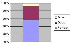
Figure 15. The distribution of the performance evaluation
based on the three categories: perfect, good, and error.
Most of the splitting errors in the category of ¡°Good¡± are related to styles
(including CSS), absolute positioning, or scripts used to display dynamic menus.
When browsing a web page on a mobile device, these errors usually do not affect
the viewing because most of these features are not supported by mobile
browsers.
For example, a web page from MSNBC uses absolute positioning to place its
right side bar, as shown in Figure 16(a). Although the right side bar is
correctly detected and put into a sub-page, its position information causes a
problem in display on desktop PC, as shown in Figure 16(b). But fortunately
on a mobile device such as a Pocket PC, the absolute positioning is ignored by
its web browser, so the result still looks fine, as shown in
Figure 16(c).
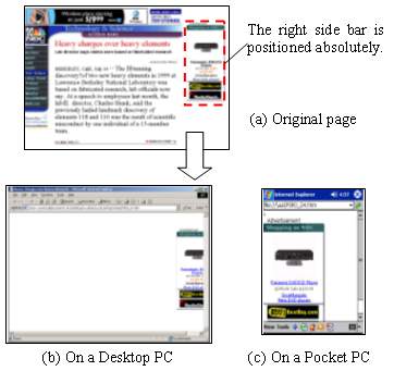
Figure 16. The problem caused by absolute positioning of
the right side bar in (a). When the corresponding sub-page is shown on a desktop
PC, its position information causes a problem as shown in (b), but fortunately
most mobile browsers will ignore the information, so the result on these small
devices would still like fine as shown in (c).
We also evaluate the processing requirement of our algorithm. Figure 17
shows the computation time for the three major processing in our algorithm. The
experiment was conducted on a personal computer with 1.7 GHz CPU and 512M main
memory. The result is shown in millisecond. The page analysis and splitting
processing together take no more than 200 milliseconds. The thumbnail generation
is slow because we currently use screen copy to obtain the image of the entire
web page.
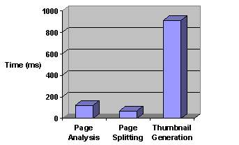
Figure 17. Processing time for our page adaptation
algorithm
5.1 Further Analysis of the Results
In the following, we further discuss some of typical errors happened in our
experiment.
5.1.1 HTML Syntax Error
In the page analysis stage, HTML syntax errors left by the author could cause
the html parser to produce erroneous HTML DOM tree, which could sometimes make
the high-level content block detection produce unexpected results. For example,
a pair of misplaced <FORM> and </FORM> in a web page
causes our parser to place the footer of the web page under a small table in the
body. Consequently, the high-level analysis failed to detect the content in the
footer and produced an incorrect result.
5.1.2 Side Effects of Splitting
Splitting a large web page into smaller sub-pages could decrease client
loading time if it fetches only a few interested sub-pages. However, the
presentation of a sub-page sometimes could look slightly different from what it
appears in the original web page. For example, the home page of Lycos
(www.lycos.com) uses an <IFRAME> as its header with width set to
100% and scrolling set to no, which means its width is
equal to its parent tag. After splitting, the parent tag¡¯s width is decreased,
making the content in <IFRAME> clipped. Since <IFRAME>
does not has scroll bars (scrolling property is no), the user
cannot browse the content which is clipped due to the smaller width.
Another side effect is related to scripts. For example, some web pages use
scripts to create dynamically scrolling text (e.g. www.netscape.com). After
splitting, a script and the text it controls could be stored into two different
sub-pages because they are located far away from each other in the original web
page. As a result, the sub-page containing the script produces incorrect result
while the text in the other sub-page cannot scroll.
5.2 Auto-positioning instead of Splitting
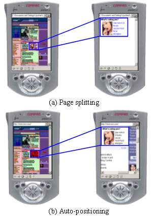
Figure 18. The comparison of web page adaptation using (a)
page splitting and (b) auto-positioning
Since scripts tend to create inter-dependencies among the different part of a
web page, they are problematic for splitting. For a web page that uses scripts
extensively, it is better not to split it. Instead, assisting the user in
scrolling the page is another direction to go.
Auto-scrolling is a scheme that positions the viewing window automatically
based on the page layout information detected by our algorithm. The difference
between this approach and the previous one is that the original web page is
viewed when the user clicks on a block in the thumbnail view. That is, the
browser switches back and forth between the thumbnail and orignal web page to
provide the scrolling-by-block function. This method generates a very similar
user experience to the page splitting method. Figure 18 shows the
comparison of web page adaptation using page splitting and auto-positioning.
6. CONCLUSIONS
In this paper, we proposed a new method for facilitating the browsing of a
large web page on a small screen. A web page is adapted and converted into a two
level hierarchical organization with a thumbnail page at the top level for
providing a global view and index to a set of sub-pages at the bottom level for
detail viewing. We developed a page analysis algorithm to extract the semantic
structure of an existing web page and a page splitting scheme to partition the
web page into smaller and logically related content blocks. Our approach enables
a new mobile browsing experience by first presenting the thumbnail view of a
give web page and then allowing the user to select a particular region to zoom
in for detail information. Such a new browsing method overcomes the limitation
of a mobile device with a small screen and makes them truly useful for
information access. A large amount of experiment and performance evaluation was
also conducted to show the effectiveness of our proposed algorithms.
7. ACKNOWLEDGMENTS
We are thankful to Mingyu Wang, Xing Xie, and Zheng Zhang for many valuable
discussions in shaping up this work.
8. RERERENCES
[1] Ashish, N. and Knoblock, C.
Wrapper Generation for Semi-structured Internet
Sources. Proc. PODS/SIGMOD¡¯97, May 1997.
[2] Bickmore, T.W. and Schilit,
B.N. Digestor: Device-independent Access to the World
Wide Web. Proc. of the 6th WWW Conference,
1997, pp655-663.
[3] Buyukkokten, O., Garcia-Molina, H.
and Paepcke, A. Accordion Summarization for End-Game
Browsing on PDAs and Cellular Phones. Proc. of the
SIGCHI Conference on Human Factors in Computing Systems, 2001,
pp213-220.
[4] Buyukkokten, O., Garcia-Molina, H.
and Paepcke, A. Seeing the Whole in Parts: Text
Summarization for Web Browsing on Handheld Devices. Proc. of WWW-10, May 1-5, 2001, Hong Kong.
[5] Chen, J.L., Zhou, B.Y., Shi, J.,
Zhang, H.J. and Wu, Q.F. Function-based Object Model
Towards Website Adaptation. Proc. of WWW-10, May 1-5,
2001, Hong Kong.
[6] Fox, A., Gribble, S.D., et al.
Adapting to Network and Client Variation Using Infrastructural
Proxies: Lessons and Perspectives. IEEE Personal
Communication, V5, I4, 1998, pp10-19.
[7] Gu, X.D., Chen, J.L., Ma, W.Y., Chen,
G.L. Visual Based Content Understanding towards Web
Adaptation. 2nd Intl. Conf. on Adaptive
Hypermedia and Adaptive Web Based Systems (Malaga, Spain, May 2002),
pp164-173.
[8] Hammer, J., Garcia-Molina, H., Cho,
J., Aranha, R. and Crespo, A. Extracting Semistructured
Information from the Web. Proc. PODS/SIGMOD¡¯97, May
1997.
[9] Hori, M., Kondoh, G., Ono, K.,
Hirose, S. and Singhal, S. Annotation-Based Web Content
Transcoding. Proc. of WWW-9, Amsterdam, Holland, May
2000.
[10] Milic-Frayling, N. and Sommerer,
R. SmartView: Flexible Viewing of Web Page
Contents. Poster paper at the Eleventh World Wide Web
Conference, Hawaii, 2002 (http://www2002.org/CDROM/poster/172/).
[11] Rahman, A.F.R., Alam, H., Hartono,
R. and Ariyoshi, K. Automatic Summarization of Web
Content to Smaller Display Devices. In: Post
Presentations of 6th International Conference on Document Analysis and
Recognition, Seattle, The United States, Sept. 10-13, 2001.
[12] W3C. Cascading Style Sheets.
http://www.w3.org/Style/CSS/
[13] W3C. HTML 4.0 specification.
http://www.w3.org/TR/html4/
[14] Wang, Y.L. and Hu, J.Y.
A Machine Learning Based Approach for Table Detection on The
Web. Proc. of WWW2002, May 7-11, 2002, Honolulu,
Hawaii, USA.
[15] Yang, Y.D., Chen, J.L. and Zhang,
H.J. Adaptive Delivery of HTML Contents. WWW9 Poster Proceedings, May, 2000, pp24-25.
[16] Yang, Y.D. and Zhang H.J.
HTML Page Analysis Based on Visual Cues. In: 6th International Conference on Document Analysis
and Recognition, Seattle, The United States, Sept. 10-13, 2001.