Abstract:
For most people, data is more easily understood if visually presented. Data is easily displayed in graphical format if two parameters need to be plotted. If three parameters which are related in a cause and effect relationship, three two dimensional graphs can be used, or they can be plotted on an isometric projection with the third parameter being plotted on a third axis drawn on a 45 deg angle to the other axes. This is a slightly better solution. Another method that has been used is to form a plane with the graphical points with shading, which is also understandable and more comprehensive than reading data in table format.
If data could be displayed in three dimensions dynamically, the viewer could rotate the data in a direction that is the most understandable to them. In this project, I have written software in C++ and OpenGL which will display three dimensions in an isometric projection which is relatable by the user with the keyboard and mouse to a position that is most understandable to them. In addition, there is an option to display the data in 3-D where the data points are displayed twice, rotated and translated with respect to each other and colored red and blue so that the user who wears red-blue 3-D glasses may see the data displayed in 3-D.
Introduction
Recent research into 3-D data display includes virtual reality, visualization of chemical and biological models, ocean floor mapping including military use for submarine tracking and commercial use in fish tracking, cloud mapping from satellite data, mapping of airplane locations for air traffic controllers, all of which aim to display or simulate real objects. Other research aims to display more ethereal data such as presenting a visual representation of software complexity, relationships and execution times.
A few researchers have investigated the use of 3-D display of data to more easily understand path tracing in a graph [1]. Some other researchers have investigated what visual cues are used to recognize an object as existing in a 3-D setting [2], [3], [4], [5].
In this paper, I explore the benefits of using inexpensive red-blue stereo glasses to view data plotted on three axes.
How Objects are Perceived in Three Dimensions
Humans use a number of visual depth cues to perceive that the object that they are viewing is a 3-D object. In order to produce this effect, several of these cues must be simulated on a 2-D computer display.
Interposition: An object that occludes another is presumed to be closer; shadows are a form of occlusion.
Shading: Closer objects are brighter, distant ones are dimmer.
Lighting: how a curved surface reflects light suggests the rate of curvature.
Size of Known Objects: Closer objects are expected to be larger, if objects appear to be the same size, the one known to be larger is further away.
Linear Perspective: Objects get smaller the further away they are and parallel lines converge in the distance
Detail: Closer objects have more detail than further objects
Height: Higher objects are further away lower objects
Atmospheric Effects: Objects that are further away are not as well focused than near objects
Relative Motion: Objects that are further away move more slowly than close objects
Binocular Disparity: There is a difference in the object seen by each eye because because the eyes are separated horizontally by the interocular distance.
Accommodation: There is a tension applied to the lens in the eye to change the focal length to accommodate viewing objects at various distances.
Convergence: There is a muscle tension to rotate the eyes to focus on objects at various distances.
Since in this study no physical object was being rendered, rather a set of points were being plotted, the first eight of these cues are not applicable. Most people find that Binocular Disparity is the dominant cue for perceiving depth. This study focuses on Binocular Disparity and Relative Motion when presenting plotted points to assist the user in perceiving depth while viewing the graph.
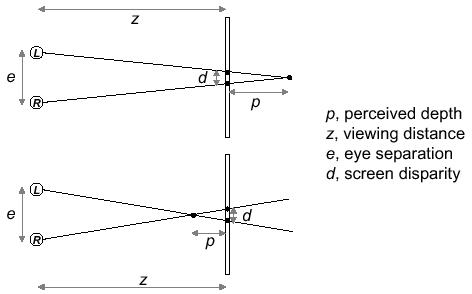
Fig 1: Perceived depth behind and in front of display plane
The perceived depth of an point displayed on a viewing screen is dependent on eye separation, viewing distance to the display screen, and screen disparity. For the viewer to perceive a point as being behind the screen, the point to be seen by the left eye must be translated to the left on the viewing screen and the point to be seen by the right eye must be translated to the right on the viewing screen. When the points projected for the eyes are reversed, the point is perceived as being in front of the screen. If the eye separation distance for which the display was modeled differs from the actual eye separation of the viewer, then the point will be perceived at a different depth than was intended. One solution is measure the actual eye separation of the user. This is impractical for generalized software.
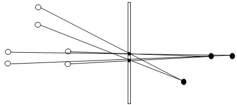
Fig 2: The perceived location of the point is dependent on the position of the viewer
When two points are projected on the screen, with only one viewable by each eye, the perceived location of the point is dependent on the location of the viewer relative to the screen and on the location of the points on the screen. If a viewer views a point from a different location for which the projected image was modeled, the point will be perceived to be in a different location. One solution is to use head tracking. This is both expensive and not available in most locations.
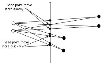
Fig 3: Moving points on the screen is another depth cue to the observer
To simulate Relative Motion, where an object in the distance is perceived to move more slowly than a close object, move points representing points that are intended to be perceived to be closer more quickly across the screen than points intended to be perceived at a greater distance. Since the distance between points displayed on the screen indicate to the viewer the distance the object is from the viewers eyes and since the relative motion of the points on the screen give a second cue to the viewer that relative motion has occurred, these two effects are exploited in my software below to create the illusion of depth for the viewer.
These effects can be created by several methods:
Each eye sees a different screen. One method that has been used is presenting objects on two screens and using optics to project each screen to a different eye.
Two different objects are projected onto one screen. The screen intended for each eye is separated by one of several methods
Glasses with active liquid crystal shutters allow one eye to see the screen while the image intended for that eye is displayed on the screen, then the liquid crystal shutter for the other eye opens (closing the shutter for the first eye) while the image intended for the second eye is displayed on the screen. These glasses are expensive and there must be a control system for the shutters making this system more complex. Also ghosting can occur because of phosphor persistence.
Passive polarized glasses are used, with the glass polarized 90 degrees from each other; the images projected are also polarized to match the polarization of the intended eye. While the passive polarizing glasses are not expensive, there must be a more complex system to polarize the light from the screen, which is more expensive and not available to most computer users. Also if the head is tilted while viewing, ghosting can occur in which some percentage of the image intended for one eye is seen by the other eye.
Passive multicolor glasses, such as red-blue glasses are used, with images intended for one eye projected in one color and the image intended for the other eye projected in the other color. This is the least expensive method, almost all computer displays have color capability, the phosphors in the display project three primary colors - red, blue and green, and red-green and red-blue glasses are both available inexpensively. While there is a reduced ability for some people to fuse images when color separation is used, this method was chosen for its cost and ubiquitous availability of color displays.
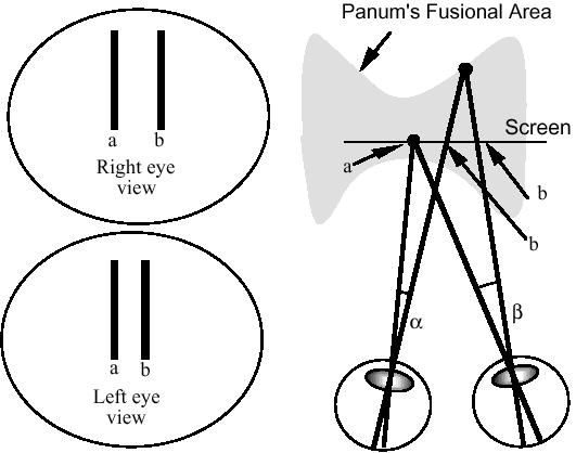
Fig 4: Panum's Fustion Area is the area most easily fused by the average person
People who can fuse multiple images into a 3-D image have a limited range of depth which can be fused. Points outside of this range either cannot be fused or are more difficult to fuse into a 3-D image. The approach taken with the software developed below is to normalize all data to a zero to one range, thereby making the Panum's Fusion area less of a problem as well as allowing all of the data to be seen on the screen.
Advantages of 3-D Data Representation
I made an extensive, albeit not exhaustive, search of recent papers comparing 2-D data display to 3-D data display. Only one paper [1] could be found which had been published in the last three years making this comparison.
This paper compared 2-D data display to 3-D data display and found a strong correlation between greater understanding of data presented and the use of 3-D data display under the right viewing conditions. In this paper, a large arbitrary complex graph was presented in 2-D and 3-D and the ability to understand the connectivity of the graph was measured. This was compared to an arbitrary tree. Also tests were preformed to determine if head motion or scene rotation would contribute more to data understanding. In addition, the users hand motion was coupled to the scene perspective to determine if this type of user input could contribute to greater understanding of the data presented.
The results of these experiments showed that with a head coupled display (tracking head movement to be able to present a correct display to each eye), the error rate in perceiving a path through a complex graph ranged from 2 to 2.5 times greater (between the lower value of the upper confidence interval to the upper value of the lower confidence interval when the confidence interval represented one standard deviation) for 2-D displays when compared to 3-D displays. There was no significant difference in the response times (time for the user to perceive the path through the graph) between 2-D and 3-D displays.
In another experiment designed to determine which type of movement would enhance understanding of complex graphs to the greatest degree, 2-D was compared to static display with only relative size and occlusion as cues, 3-D with no rotation, passive rotation displaying 2-D images, 3-D passive rotation, hand coupled 2-D rotation, hand coupled 3-D rotation, head coupled 2-D and head coupled 3-D. Results were compared using t-tests. Test results indicate that both rotation and 3-D played an important part in reducing errors in perception of a path through the graph. The greatest reduction in perception error was found to be using hand coupled rotation with 3-D display. This is the approach taken by my software below.
The Software
The software is written in C++ and OpenGL [6]. OpenGL uses matrix multiplication to move, not the object being viewed, but the camera (viewer) location relative to the object being viewed. A 4 x 4 matrix representing x, y, z locations and d, the camera location compares the word frame to the camera frame. Through matrix and vector multiplication, the apparent location and orientation of the object, which is actually the position and orientation of the camera view of the object can be translated, rotated, scaled, and even sheared. These transformations can be concatenated, and applied separately to different objects in the same scene. For instance, if an object is translated to the origin, rotated and translated to its original position, the object will appear to have rotated on its axis in its current location. If the object is rotated without these translations, it will appear to have orbited the origin, and to have rotated so that the same face remains facing the origin.
The program reads an input file containing three fields per tuple, the x, y, and z components of points in space. The format is float, space, float, space, float, endline. The data is read into an array (small data size and faster) Max tuples = 1000 (if there are more tuples than 1000, the remaining data is truncated.) The data in the array is normalized to between 0 and 1 for consistent display. The initial display is 2-D and is rotatable around all three axes with the arrow keys and mouse. The display can be switched to 3-D which requires red-blue 3-D glasses. The program can be viewed here in pdf format.
In addition, two small programs were written to generate data. The first program generates a data file with x ranging from -2pi to 2pi as inputs to sin and cos functions to produce y and z respectively. Output is written to a file "sin_cos.txt" with this format: x, space, y, space, z, endline. This data was used to display a graph that was of known shape for testing the 3-D software above and can be viewed here in pdf format.
A second small program was written to generate data that is representative of real data flows. This program generates a data file with x ranging from 0.1 to 0.9 (representing propagation delay in ms), and y ranging from 0.1 to 1.0 (representing frame size in bytes), both as inputs to produce z (representing channel utilization). Output file is utilization.txt with this format: x, space, y, space, z, endline, and can be viewed here in pdf format. This software can be viewed here in pdf format.
The software is compiled for a Windows operating system, and, although it uses a Windows messageBox, could be easily ported to Linux by displaying the messageBox information on the console window. Download the executable file, the two libraries and the data files into a single directory and run the executable, which has a help messageBox which describes how to control the display. If you have red-blue 3-D glasses, you will be able to view the 3-D portion of the program.
There data files are sin_cos.txt as described above, and there are two data files, utilization_hi.txt and utilization_lo.txt. The utilization_hi.txt data was generated with propagation and frame size incremented by 0.03, giving a more densely populated display, while the utilization_lo.txt was generated with propagation and frame size incremented by 0.1, giving a less densely populated display. The utilization_hi.txt data is more easily seen using the 2-D display because in the 3-D mode, many points are hidden behind adjacent points as the display is rotated. The utilization_lo.txt and sin_cos.txt are displayed equally well with the 2-D and 3-D display. The utilization does not display as well as the sin_cos data in the 3-D display, the dot density reduces the 3-D effect. The 3-D effect seems to be more effective when displaying data that forms a single line rather than an array of data.
Download the data, software and libraries here in zipped format. Unzip them into a single directory.
Conclusions
Plots of points in three dimensions (plotted on an x, y, and z planes) are more easily understood if they can be rotated in real time. This can be done with the software developed above. Further enhancement to understanding can be made by projecting two images on the screen in two different colors and using color glasses to allow only the image intended for each eye to reach the intended eye. This is both inexpensive to implement and available to almost all computer users.
There are some problems associated with using this inexpensive method. The user viewing at a different distance, position or with a different eye separation than the designed distances will see the images differently than intended. Some patterns, especially ones where a matrix of dots closely spaced are not as easily fused into a 3-D image. Since images are translated along the x axis, when an image is rotated so that the x axis is oriented perpendicular to the screen, there is no 3-D effect, however if the rotation is continuous, this will not be noticed because the relative motion cue will maintain the 3-D image effect. If the original image was intended to be perceived behind the screen, when an image is rotated around the y axis to 180 degrees, the image will be perceived to be in front of the screen. Since the image being displayed is only a graphical representation of data points, this should not interfere with the enhanced understanding of the data from using a 3-D projection. Fusing different color images is more difficult than fusing images that are the same color. This does reduce the ability to fuse some images using this software. However, if the image cannot be fused, the option exists to display the data in 2-D and rotate it for a 3-D effect from relative motion.
References
1 Colin Ware and Glenn Franck, Evaluating Stereo and Motion Cues for Visualizing Information Nets in Three Dimensions, TOG Info Net Vis April 20, 2000
2 Colin Ware, Cyril Gobrecht and Mark Paton, Dynamic Adjustment of Stereo Display Parameters, IEEE Trans on Systems Many and Cybernetics (in press)
3 Nick Holliman, University of Durham, 3D Display Systems, DRAFT v3, March 28, 2003
4 Paul Bourke, Swinburne University of Technology in Melbourne, Australia, Calculating Stereo Pairs, July 1999
5 William R. Sherman & Alan B. Craig, Understanding Virtual Reality, Morgan Kaufmann Publishers 2003 ISBN: 1-55860-353-0
6 Edward Angel, Interactive Computer Graphics: A Top-Down Approach with OpenGL, Second Edition, Addison-Wesley 2000 ISBN: 0-201-38597-X
Other Important Links
http://www.caida.org/ CAIDA, the Cooperative Association for Internet Data Analysis, provides tools and analyses promoting the engineering and maintenance of a robust, scalable global Internet infrastructure. They use various visualization techniques to represent internet traffic flow.
http://www.msci.memphis.edu/~maleticj/visual/ Workshop on Data Visualization
http://bioinformatics.ccr.buffalo.edu:8080/Service/ServerViz Software developed to visualize data in 3-D
http://www.ccom.unh.edu/vislab/ Data Visualization Lab: various experiments and software for interactively visualizing data in 3-D
http://www.cc.gatech.edu/gvu/datavis/ Projects in virtual realty, weather, stereo viewing, human interaction
http://www.nas.nasa.gov/Groups/VisTech/visWeblets.html This page is an annotated bibliography of scientific visualization web sites around the world. It is a service of the NAS (Numerical Aerospace Simulation) Facility at NASA Ames Research Center. Please note that this page is no longer maintained due to other obligations of NAS personnel. Many of the links and descriptions may be incorrect or out-of-date. However, it is extensive and well worth viewing for relevant research groups. Since it is no longer maintained and may be deleted, I have included a local copy here.