 N
N
Neighboring State Analysis for Covid-19 Cases
Computer Science Department
Kent State University
Project Description
Coronavirus
has claimed millions of lives across the globe, since
its widespread emergence in 2020. CDC COVID-19 Spatio-Temporal
dataset for state cases was used to find correlations between states
overtime. Can the analysis of COVID-19 trends and relations between
neighboring states help predict the spread and prevent the loss of lives? In
this project, we measured the correlation of the trends between neighboring
states and created dynamic visualizations to show the strengths of the
connections between states over time. With the help of these relationships, the
spread of COVID-19 can be analyzed and predicted from one state to another.
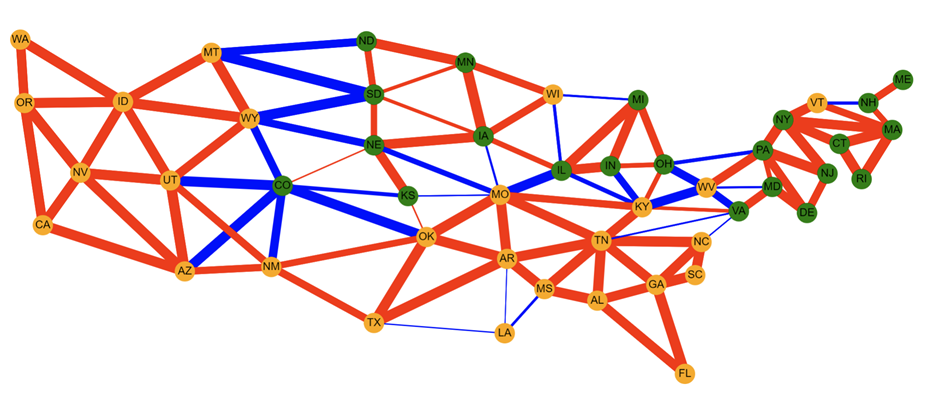
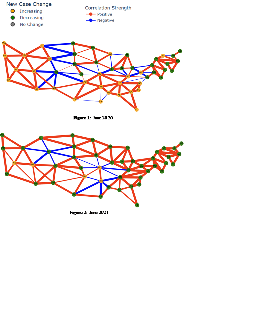
Plotly
Dash interface is used to visualize correlation of COVID-19 cases compared
between neighboring states in order to find trends to
help predict the spread of COVID-19. Weekly, Monthly, Bi-Annually, and total
windows are analyzed. Cytoscape is used to create a
network graph over time of nodes (states) and edges (correlation). This project
was for Choose Ohio First and was presented on April 10th, 2022.
Contributions
o Used Python to identify trends of cases per state
o A graph was created to visualize the states and
connections to their neighbors.
o States visualized spatially with the percent change in
cases displayed as a color
o Correlation value displayed as a colored node to
display a positive or negative change.
o Correlation strength displayed as edge thickness
o Animated temporal graph created for different time frames
Documentation
Data Sets: CDC (https://data.cdc.gov/Case-Surveillance/United-States-COVID-19-Cases-and-Deaths-by-State-o/9mfq-cb36/data)
Source Code: GitHub
(https://github.com/brandoncossin/COVID-19-Data-Mining)
Poster: http://www.cs.kent.edu/~xlian/projects/COF2022_Covid_Vis/CossinTothCOF.pdf
Video Presentation: https://www.youtube.com/watch?v=TF-fyagA3qE
Visualization Demo
|
States |
Correlations
in June 2020 |
Correlations
in June 2021 |
|
Indiana |
.421 |
.984 |
|
Michigan |
.746 |
.966 |
|
Pennsylvania |
-.314 |
.993 |
|
West Virginia |
-.787 |
.965 |
|
Kentucky |
.414 |
.989 |
|
Table 1: Case Study: Pearson's
Correlation Coefficients Between Neighboring States and Ohio |
||
Group Members
Brandon
Cossin
Computer
Science major class of 2022 with interest in data science and full stack
development.

Email:
bcossin@kent.edu
Troy Toth
Email:
ttoth5@kent.edu
Dr. Xiang Lian (Advisor)

Email:
xlian@kent.edu
Homepage:
http://www.cs.kent.edu/~xlian/index.html
Last Modified: 4/28/2022